/
ATDev

RESHAPE HEALTH GRANT WINNER

Helping Recovery at Home: Humanizing Rehab Robotics with Multimodal UX Design

ATDev, or Assistive Technology Development, is a health tech startup dedicated to creating advanced robotic devices to aid mobility and rehabilitation. Their flagship product, the Reflex device, is designed to enhance the rehabilitation process for individuals recovering from knee surgeries. Acting as "PT hands" at home, it supports patients between their sessions with physiotherapists, enhancing and ensuring the continuity of care. This tool empowers professionals by providing them with detailed progress reports and allows them to fine-tune rehabilitation programs based on real-time data collected by the device. The grant project aimed to refine the Reflex device's user interface, introducing a multimodal approach that blends touchscreen and physical interactions to improve patient engagement and ease of use at home.

Reshape Health Grant winners

The main reasons they won our Reshape Health Grant were the following:

Aligning Visions for Future Healthcare

ATDev is committed to improving mobility for disabled patients directly in their homes. Beginning with knee rehabilitation, they aim to broadly apply robotics to enhance everyday life for those with mobility challenges, pushing the boundaries of home-based care.

Advancing Telehealth

Our choice was also influenced by ATDev's alignment with telehealth advancements. Their technologies facilitate remote healthcare delivery and patient independence, essential for democratizing access to medical services. The ability to monitor and optimize treatment remotely fits perfectly with our goal of making healthcare more accessible and efficient.

The health for Aging Population

Our interest in supporting aging populations aligns closely with ATDev’s focus. Knee replacements are common among the elderly, and ATDev’s Reflex device aids their recovery. This strategic alignment in addressing significant healthcare challenges for aging adults influenced our decision to select ATDev as a grantee.

Improving the Reflex user experience

Before moving to the UX optimization, let's talk about how Reflex helps patients. Someone recovering from knee replacement surgery traditionally needed to travel frequently to rehabilitation centers, starting immediately after surgery to prevent mobility loss. The Reflex device allows these patients to begin their rehabilitation at home, reducing travel and enabling quicker recovery starts. It also permits physicians to track progress remotely, ensuring effective and personalized care.

From the start, our goal was clear: to close the gap between the advanced technology of the Reflex device and the real-world needs of patients recovering from complex knee surgeries. After deep research and interviews, we identified key features to make the Reflex device more centered around the patient:

  • Designing for a Small Screen: We tackled the challenge of creating a user interface on a small screen where every detail counts. Our focus was on making information clear and simple, ensuring important details were easy to read without clutter.

  • While our direct development was concentrated on the touchscreen, we also provided recommendations to better integrate the physical buttons, haptics, and lighting elements. These suggestions aim to ensure a cohesive user experience across all interaction modes.

  • By collaborating with physiotherapists, we refined the language and instructions of the device to ensure they were straightforward and effective. This effort made it easier for patients to follow their recovery routines.

Maximizing the potential of a small screen
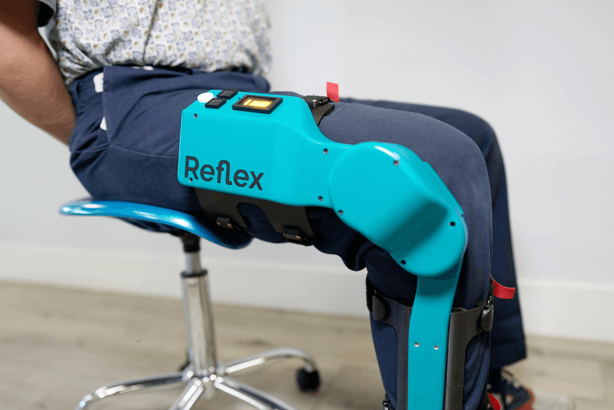
Figure 2: The touchscreen provides continuous feedback for the patient.

ATDev screen is significantly smaller than that of an iPhone 14. Designing a user interface for a product with small dimensions presents unique challenges that require innovative solutions.
When considering minimalist design, one might assume that smaller screens make the task easier due to less space for unnecessary elements. However, it can be the other way around.
Our goal was to create a minimalistic UI that could display relevant information like movement, status measurements, and instructions clearly. For a device this size every pixel counts, therefore, animations must be designed to be subtle yet distinct, guiding users effectively without being overwhelming due to the limited space. Utilizing a combination of directional arrows, concise one-word instructions, and a strategic color scheme significantly enhanced user comprehension. Additionally, considering the device's angled screen position, it was crucial for us to ensure content readability through large font sizes and high-contrast visuals. This approach not only improves visibility but also accommodates users with visual impairments or color blindness, making the UI accessible to the target audience.

Figure 3: Directional arrows and commands on the device, inform users about the correct movements and directions for leg exercises.

Beyond the screen:
A cohesive multimodal UX

Considering the device’s placement on the leg, far from the user’s eye, various components beyond the touch screen enhance the overall user experience. These additional features were carefully integrated to ensure they didn’t distract the user. 

  • Haptics: We incorporated haptic feedback to provide a tactile indication of task completion and other relevant events. When necessary, the device would use haptics to follow the on-screen indications, prompting the user to take action.

  • Physical Button: To simplify interaction, a physical button was included as part of the device’s interface. Users can easily play and pause without relying solely on the touch screen.

  • Lighting: The surrounding lighting serves as a visual cue, conveying the general status of the activity. Whether it’s indicating readiness, progress, or completion, the lighting enhances user awareness.

Figure 4: Initial sketches were created to map the leg angle positions and degrees, but these were later discarded in favor of clarity regarding direction.

From High to low complexity.

During the UX sessions, we thought of the benefits of visually representing leg movement within the user interface. Specifically, we wanted to mirror the leg’s real-life motion as users engaged with the device. We began with 3D concepts, envisioning intricate animations that would mimic leg movement. However, we soon realized that implementing 3D animations on a small screen posed significant complexity, so to strike a balance between realism and practicality, we shifted our focus to 2D implementation. This allowed us to convey leg movement effectively without overwhelming the user interface.

After the user testing sessions, we realized that representing leg movement wasn’t as important for the user as indicating the leg movement direction, drastically reducing the content we display on the screen and optimizing the experience to make it clearer for the user

Following our user testing sessions, we gained valuable insights. Different from our initial assumptions, users didn’t prioritize a detailed visual representation of leg movement. Instead, they were looking after clear leg movement direction cues. With this discovery from the user sessions, we simplified the interface reducing the content on the screen and introducing simpler visual indicators that were simpler to follow up.

The information we realized wasn't needed

In the original designs, the interface was cluttered with information that lacked meaningful value to the user, making it irrelevant to display. We had to carefully go through all the information and decide what was important and what wasn’t.

For physical therapists, details such as angles, past achievements, and velocity were significant, yet for Reflex users, these were not essential. The device’s limited screen size further complicated the visibility of such data.

Therefore, we shifted our emphasis to what truly mattered to the user: achieving their goals. We concentrated on providing clear, actionable instructions to guide users through their exercises, rather than fixating on numerical objectives.

Content: Getting help from the experts.

Refining instructions to a single and understandable term was our approach in this user interface design, particularly in the context of physical therapy where clarity is crucial.

To accomplish this we worked closely with physical therapists, we simplified movement directions into one-word instructions, and we went from ‘push’ and ‘extend’ to ‘straighten’ and  from ‘pull’ and ‘flex’ to ‘bend.This approach not only improved the user experience but also ensured medical accuracy.

We carefully review content and choose terminology to ensure effective digital health tools. This approach emphasizes user-centered design and collaboration across disciplines. It reflects how meaningful collaboration can make health guidance accessible, regardless of people’s familiarity with the product or medical terms.

The voice interface opportunity

During our early UX sessions, we considered adding a voice interface to enhance the product experience. We recognized that some users might struggle with on-screen content due to visibility disabilities. However, due to hardware limitations, we decided to focus on the touchscreen interface and physical buttons, leaving the voice concept out of scope.

Interestingly, user testing sessions consistently revealed that many users found a voice interface valuable. Reinforcing the importance of supporting interfaces beyond visual elements, emphasizing other senses making the product more accessible to a wider range of users.

Efficient Remote Testing with Hybrid Methods

Faced with tight project timelines and unable to develop an on-device prototype, our team adapted by utilizing remote testing techniques. We leveraged a Figma prototype on a smartphone to simulate the user interface, allowing for effective and immediate user feedback despite not having the new UI integrated into the physical prototype.

During sessions, users interacted with the UI prototype on their phones while our UX team observed and conducted interviews remotely.

Summary

Summary

Summary

What we learned

What we learned

What we learned

  • Demographic Insights:
    We learned that knee replacement surgery predominantly affects adults around 65 years old, with notable anatomical differences between men and women affecting the procedure and recovery process. Additionally, injuries like the anterior cruciate ligament (ACL) are more prevalent among younger, sports-active populations, showcasing diverse rehabilitation needs across age groups.

  • Pain, Motivation, and Accountability:
    Our research highlighted that pain and fear significantly influence patient engagement during the initial post-surgery sessions. Understanding the critical role of motivation in recovery, we recognized the indispensable support provided by physiotherapists (PTs). Additionally, we explored the concept of accountability, highlighting the importance of the patient's responsibility and active involvement in their recovery for successful outcomes.

  • Challenges in Human-Robot Interaction:
    Working on the interface between humans and robots uncovered several challenges. Making sure the device's motor functions and ergonomics fit well with human anatomy was crucial. We also addressed the nuances of exercises specific to different rehabilitation needs and tackled the inherent fear patients might have about losing control of an automated system.

Conclusion

Conclusion

Conclusion

Throughout the ATDev project, our collaborative efforts helped to improve the Reflex device User experience, merging their cutting-edge technology with deep insights into rehabilitation needs. By focusing on user-centric design, remote testing methodologies, and the integration of physiotherapist feedback, we've enhanced the device's functionality and accessibility.