Reshape Health Grant Winner
Beyond the Surface: Bedsores early detection journey
This project focused on enhancing the app’s user experience, specifically optimizing the early detection and prevention flow to make it more accessible and intuitive for non-skilled caregivers at home.
The vision
Rubitection is a healthcare platform designed for the early detection and care management of bedsores. It combines AI, a portable device, and a companion app to provide a holistic approach to wound care.
The Transformation
Through our collaboration with Rubitection, we worked to enhance the app’s user experience, making it accessible and straightforward for caregivers. Trough the design process, we refined the user interface to guide caregivers through each step of wound assessment, providing all the input data to finally deliver a care plan.
We encountered and overcame several challenges, such as optimizing the body map to include less common wound sites and ensuring the system's flexibility to accommodate varied user preferences and treatment options. Insights gained from extensive user and expert feedback were invaluable in iterating and refining the UI and improving the user experience.
AI
Healthcare
Team
UX/UI Designer
Product Manager & Facilitator
Delivery
Key Insights
UX/UI design
Tackling the complexity of bedsores
Bedsores, or pressure ulcers, are a critical issue often overlooked by insurance and clinicians.
When patients are discharged with open wounds, their families can feel overwhelmed by the extensive care required to prevent the wound from worsening and to avoid the development of new wounds.
Families can’t always rely on medical help from doctors and nurses since they are not always available to visit and review patients' recovery processes.
The management of a patient with an open wound presents a dual challenge.
First, there is a critical need to consistently monitor the wound's healing process, ensuring it progresses towards complete recovery or at least doesn't worsen. Effective care management and continuous treatment are vital to this end.
Secondly, patients confined to a bed or wheelchair require regular assessments to prevent the onset of new injuries. Early detection is crucial in both managing existing conditions and preventing the development of additional complications.
The Rubitect Assessment System (RAS) aims to tackle these problems. A low cost hand held device and a mobile companion app are combined with computer vision capabilities to assist the low skilled caregiver for early detection, while the whole system and monitoring platform help them and the patients family to manage wounds efficiently.
This case study will concentrate on the risk assessment and early detection of wounds user flow, highlighting the importance of promptly identifying and treating wounds to prevent them from worsening, which can lead to serious health complications and expensive treatments.
Given that this is a consumer product, a primary UX challenge was to develop a system that is accessible and requires minimal training, enabling anyone in any care setting to effectively use it.
Early Detection Journey
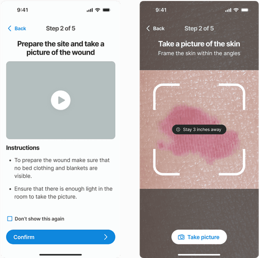
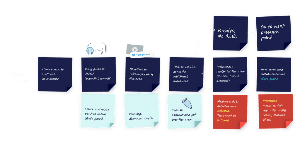
Guiding caregivers to detect early signs of pressure ulcers is crucial. Visual inspections can lead to assessment and treatment errors, especially with low-skilled caregivers. Our challenge was to guide the user through the skin pressure points, where signs of a wound might appear:
Each of these steps represented challenges for the user interface.
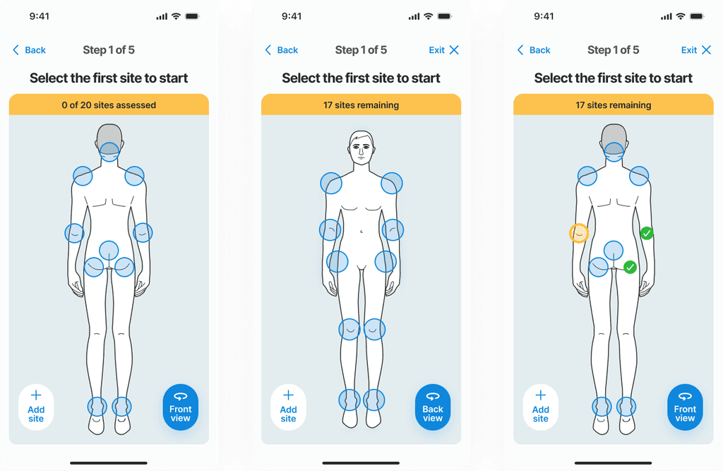
Challenges appeared with this type of approach, where a two-sided body hides information, and how hip position on the side can be presented on either back or front view.
Where to start? A map of the body
A body map is essential for guiding users on where to check for potential wounds. Before taking a picture, users must understand which areas of the body are most susceptible to pressure ulcers, typically where the skin is pressed against prominent bones. To assist users in identifying these high-risk areas, a wizard along with a detailed body map is provided, clearly highlighting points that are more prone to developing wounds.
The highlighted feedback from a test user regarding the body map guide reveals an important oversight in the initial design. During the test interview the user pointed out that their patient had developed a pressure ulcer on the hands—an area not listed in the body map as a common site for such wounds. This observation indicates that our current model does not account for all possible scenarios where pressure ulcers can occur, suggesting that less typical sites can still be at risk under certain conditions.
Assessing the skin
Results and recommendations
After gathering all necessary inputs, the non-skilled caregiver needs clear, actionable directions to manage the potential wound and prevent it from worsening. The results are presented first, providing crucial information about the risk level and severity. Following this, a comprehensive care plan is presented with detailed instructions on the next steps to effectively prevent the wound from worsening and to promote healing.
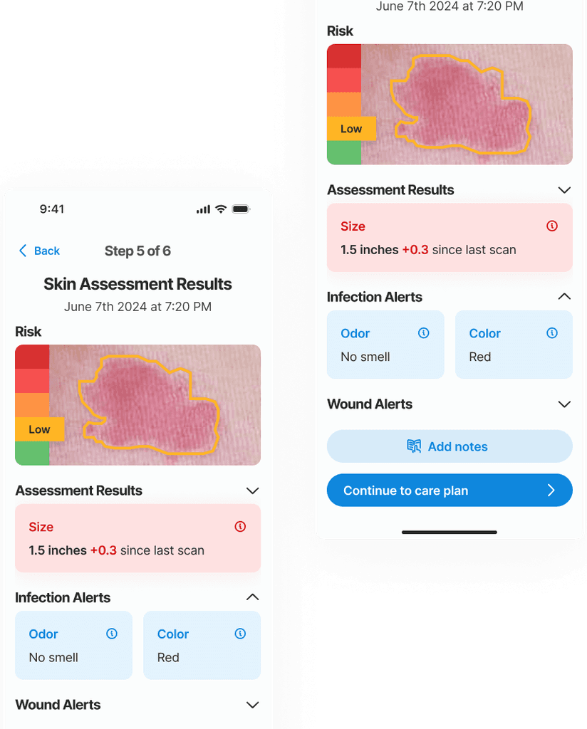
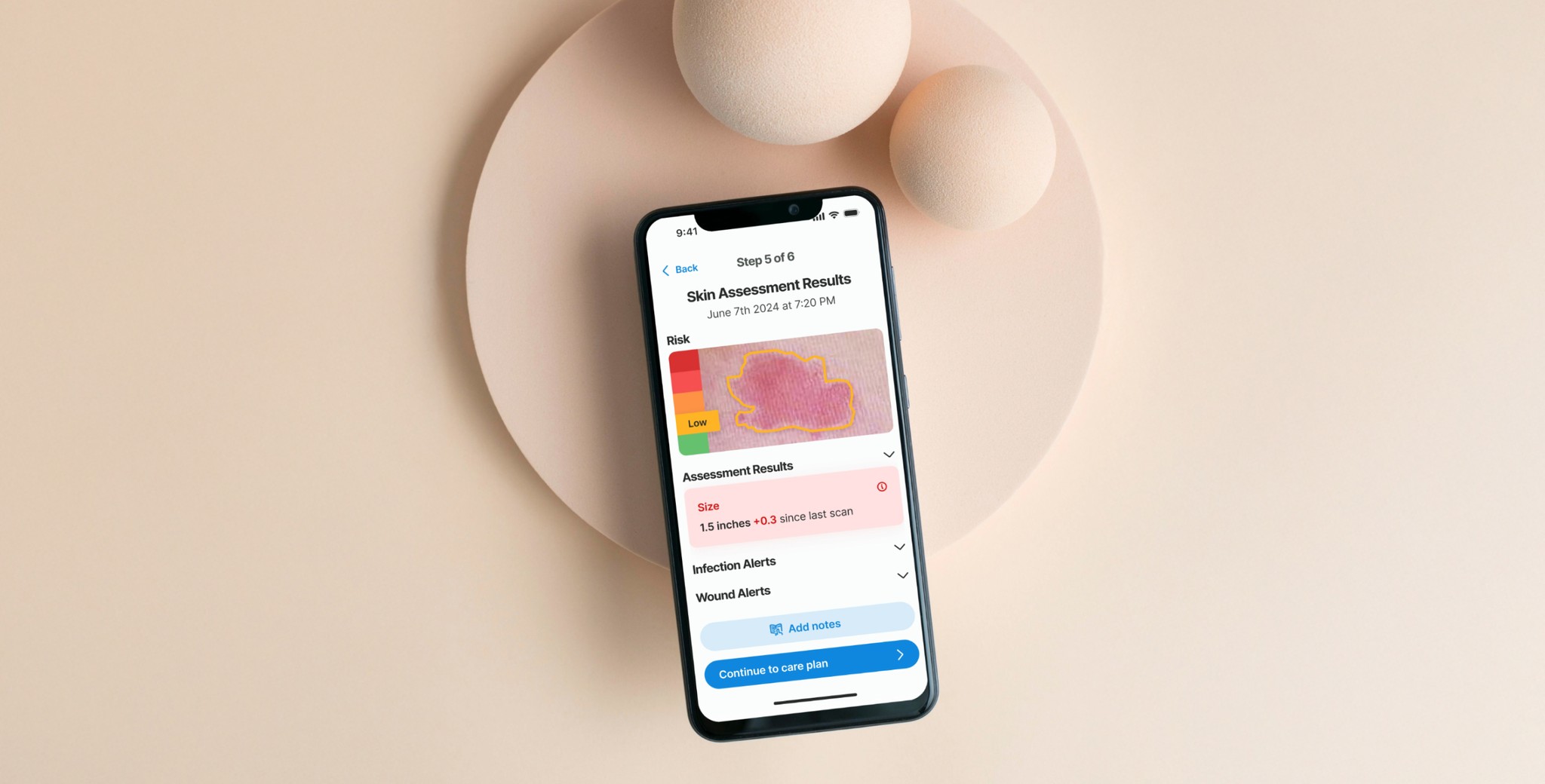
In this example an early stage (low risk) wound was found. The risk level is identified with a color known color pattern (green-yellow-red)
The system is ready to provide results on the skin condition using 3 layers of information:
Visual input of the skin color, texture and size with the Picture.
Sensory information of the patient overall skin condition with the Wizard.
Objective quantitative data aquired with the Device.
The main outcome at this step is to inform the risk level of the skin site and give a summary of the information provided in the previous steps, thereby informing and educating the caregiver.
The borders of the wound and its stage are determined by an AI algorithm that leverages computer vision, trained on a multitude of images. The size of the wound is also automatically calculated by the AI. Tracking the size changes from the initial appearance is crucial for accurately monitoring the wound's evolution and guiding future treatment strategies.The staging of the wound goes from Stage 1 to Stage 4, and is an important data point for the physicians and the medical records.
Care plan
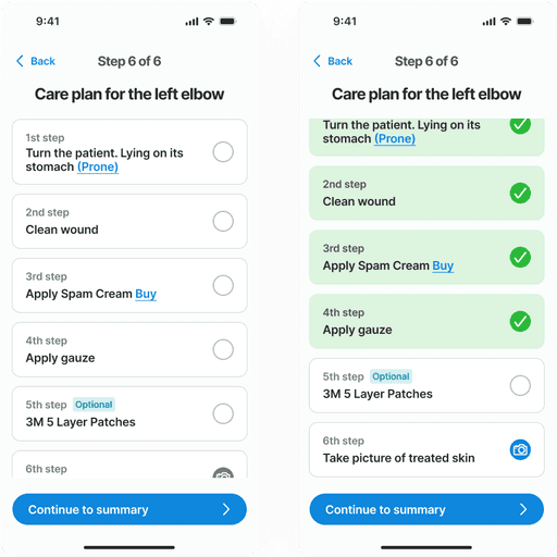
The care plan is a structured step-by-step guide to assist caregivers in managing the wound. It presents a prioritized list of tasks that need to be completed in sequence. Each step can be marked as completed to track progress and ensure that all necessary actions have been performed. This feature aids in maintaining the order and priority of the care steps, ensuring that the treatment protocol is followed correctly.
Feedback
During the user validation phase, we uncovered key insights about this screens.
The highlighted feedback from a test user regarding the body map guide reveals an important oversight in the initial design. During the test interview the user pointed out that their patient had developed a pressure ulcer on the hands—an area not listed in the body map as a common site for such wounds. This observation indicates that our current model does not account for all possible scenarios where pressure ulcers can occur, suggesting that less typical sites can still be at risk under certain conditions.
Transformation
takeaways
Thanks to this process, we learned that detecting early-stage bedsores on darker skin tones presents a unique challenge, as typical signs like redness are harder to notice. AI technology proves invaluable here, enhancing the ability to detect subtle skin changes that the human eye might miss.
Interviews with nurses and caregivers highlighted the importance of routines and reminders in wound care, especially in repositioning patients regularly to prevent pressure ulcers. This feedback led us to prioritize a notification system in the app, featuring prominent, tailored reminders for essential care tasks like repositioning and changing bandages.
